

Survival Analysis, Attractor Boundaries, and the Biomarker Replication Problem
Issue № 81 // An in-depth guide to survival analysis—and what a complex systems lens reveals about why even the best signatures can fail to generalize.


Thanks for reading! If you found this post useful, please consider subscribing or sharing it with a friend. I regularly post hands-on computational biology tutorials and perspectives on a range of topics.
Issue № 81 // Survival Analysis, Attractor Boundaries, and the Biomarker Replication Problem
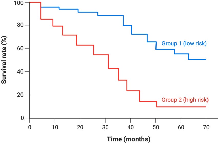
Kaplan-Meier (KM) curves are nonparametric visualizations used to compare survival probabilities between two or more groups over time.1 To plot KM curves, we need a dataset with a time variable (t) representing the duration of observation such as distance recurrence free survival (DRFS) used in oncology, a status variable (d), which is a binary indicator showing what happened at the end of that time duration (i.e., dead vs. alive), and a group variable which acts as the cohort label used to define a comparison. With this data, we can calculate the survival probability Ŝ(t) at each time point, which is plotted on the y-axis against time as depicted below.
At each time point, Ŝ(t) is calculated by multiplying the running survival probability by the fraction of patients who didn’t have an event, which is codified in the formula below where nᵢ is the number of patients at risk just before time tᵢ (alive and uncensored)2 and dᵢ is the number of events at time tᵢ.
Given a dataset with groups stored in the index, a continuous survival time column, and a binary event column, we can use the code below to generate Kaplan-Meier curves.34
def Survival_Prob(group_df, group_summary, group_name='', time_col='', death_col='', censor_col=''):
  St_list, pop_counter = [], len(group_df)
  censorted_time, cencored_St = [], []
  for i in range(0,len(group_summary)):
    if i==0:
      St = ((pop_counter - group_summary[death_col].iloc[i]) / pop_counter) * 1.0
    else:
      St = ((pop_counter - group_summary[death_col].iloc[i]) / pop_counter) * St_list[i-1]
    St_list.append(St)
    if group_summary[censor_col].iloc[i]>0:
      censorted_time.append(group_summary[time_col].iloc[i])
      cencored_St.append(St)
    pop_counter -= (group_summary[death_col].iloc[i] + group_summary[censor_col].iloc[i])
  return St_list, censorted_time, cencored_St

def Kaplan_Meier_Curves(df, group_1='', group_2='', time_col='', event_col=''):
  # Sort df by os_time values; isolate group_1 and group_2 dfs
  df = df.sort_values(time_col, ascending=True)
  group_1_df, group_2_df = df[df['treatment']==group_1], df[df['treatment']==group_2]

  # Collapse os_time rows; combine events; combine censors
  group_1_summary = group_1_df.groupby(time_col).agg(d_i=(event_col, lambda x:(x==1).sum()), c_i=(event_col, lambda x:(x== 0).sum())).reset_index()
  group_2_summary = group_2_df.groupby(time_col).agg(d_i=(event_col, lambda x:(x==1).sum()),  c_i=(event_col, lambda x:(x== 0).sum())).reset_index()

  # Calculate survival probabilities for ea/ time point
  group_1_St, g1_censored_time, g1_censored_St = Survival_Prob(group_1_df, group_1_summary, group_name=group_1,  time_col=time_col, death_col='d_i', censor_col='c_i')
  group_2_St, g2_censored_time, g2_censored_St = Survival_Prob(group_2_df, group_2_summary, group_name=group_2, time_col=time_col, death_col='d_i', censor_col='c_i')

  # Plot KM Curves
  plt.plot(group_1_summary[time_col], group_1_St, color='blue', drawstyle='steps-post'), plt.plot(group_2_summary[time_col], group_2_St, color='red', drawstyle='steps-post')
  plt.plot(g1_censored_time, g1_censored_St, linestyle='None', marker='x', markersize=5, markeredgewidth=1.0, color='black'), plt.plot(g2_censored_time, g2_censored_St, linestyle='None', marker='x', markersize=5, markeredgewidth=1.0, color='black')
  plt.xlabel('Time (days)'), plt.ylabel('Survival Probability (ŝ(t))'), plt.legend([group_1, group_2])
  plt.show()
  return group_1_df, group_2_df, group_1_summary, group_2_summary

group_1_df, group_2_df, group_1_summary, group_2_summary = Kaplan_Meier_Curves(df, group_1='standard', group_2='experimental', time_col='os_time', event_col='os_event')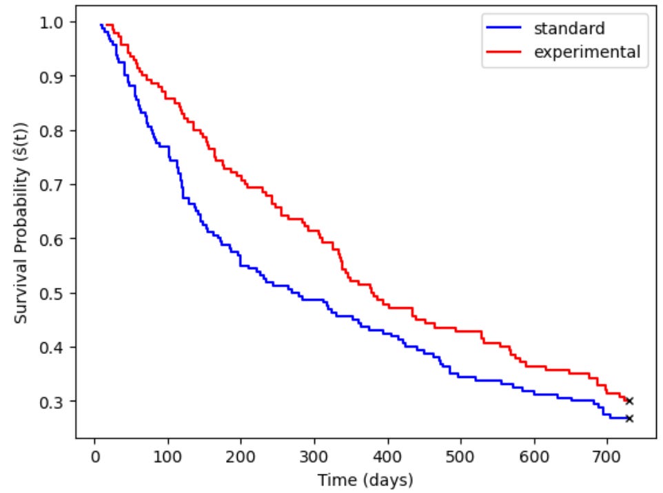
KM curves are purely descriptive in that they make no formal statistical comparison. To determine whether two group’s survival curves are meaningfully different from other another, a downstream statistical analysis is needed. Two of the more common approaches are Log-rank and Gehan-Breslow-Wilcoxon (GBW) tests. Log-rank tests compare survival curves between discrete groups and determine whether they are statistically distinguishable from one another. This method gives equal weight to all event times regardless of when they occur and as a result it’s best used when survival curves run roughly parallel to one another. GBW tests by contrast differ in two important ways: first, they give more weigh to early events, making them more appropriate when testing for acute risk (for example, does a drug improve short term, but not long term, survival?).

In order to compare two groups survival curves via a log-rank test, we need to compare the observed number of events to the expected number of events at each time point where an event occurred. Naturally, this raises the question, “how do we know the expected number of events?” To calculate the expected events for one of our groups (group 1 in this case) at each time point j, we use the following formula where N1j is the number of subjects at risk in group 1 at time j, Oj is the total events observed across both groups (O1j+O2j) at time j, and Nj is the total number of at-risk subjects across both groups (N1j+N2j).5
In addition to calculating the expected number of events for group 1, we also need to calculate the variance for group 1 (V1j) at each time point. Both formulas are depicted below.
Then, after calculating E1j and V1j at each time point j, we can sum them to get the following grand totals where O1, E1, and V1 are the total observed events, total expect events, and total variance in group 1.
We can then plug these values into the following formula to solve for the global log-rank test statistic, Z.
The code below implements all of these steps.
def LogRank_Test(group_1_df, group_2_df, group_1_summary, group_2_summary, time_col='os_time'):
  # Set time index; outer join; add df header; fill na
  group_1_summary, group_2_summary = group_1_summary.set_index('os_time'), group_2_summary.set_index('os_time')
  combined_summary = pd.merge(group_1_summary, group_2_summary, on=time_col, how='outer')
  combined_summary.columns = ['di_g1', 'ci_g1', 'di_g2', 'ci_g2']
  combined_summary = combined_summary.fillna(0)

  # Calc expected events and variance per time point
  E1j, V1j = [], []
  g1_counter, g2_counter = len(group_1_df), len(group_2_df)
  for i in range(0,len(combined_summary)):
    N1j, Nj = g1_counter, (g1_counter + g2_counter)
    Oj = (combined_summary['di_g1'].iloc[i]+combined_summary['di_g2'].iloc[i])
    if Nj >1:
      E1j.append((N1j*Oj)/Nj)
      V1j.append((Oj*(N1j/Nj)*(1-(N1j/Nj))*(Nj-Oj))/(Nj-1))
    if Nj <= 1:
      E1j.append(0)
      V1j.append(0)
    g1_counter -= (combined_summary['di_g1'].iloc[i] + combined_summary['ci_g1'].iloc[i])
    g2_counter -= (combined_summary['di_g2'].iloc[i] + combined_summary['ci_g2'].iloc[i])

  # Calclate O1, E2, V1,  and Z
  O1 = combined_summary['di_g1'].iloc[:].sum()
  E1 = sum(E1j)
  V1 = sum(V1j)
  Z = (O1-E1)**2 / V1
  p_val = stats.chi2.sf(Z, df=1)
  print('Z Statistic:', round(Z,3))
  print('Log-Rank p-value:', round(p_val,3))
  return combined_summary

LogRank_Test(group_1_df, group_2_df, group_1_summary, group_2_summary, time_col='os_time')
Z Statistic: 2.149
Log-Rank p-value: 0.143The Z-statistic follows a Chi-square distribution with 1 degree of freedom, and as a result we can plug the resultant Z value into a Chi-square table to find the log-rank p-value (Z >=3.84 corresponds to p<0.05).
When we plot KM curves, or run log-rank tests, we define a group by the absence/presence of a condition or the quantity of a given biomarker. For example, we might compare survival between a group of mice given an anti-aging drug and their control litter mates, or we might split a triple-negative breast cancer cohort into two groups based on their expression of a biomarker such as AKT (top vs. bottom quartile, for example). Because of this, log-rank tests are said to be univariate in that they evaluate the relationships based on one independent variable and a time to event outcome.
Cox proportional hazards by contrast is a multivariable regression model that measures the effect of a primary variable while adjusting for other clinical factors, or covariates, like age or sex. An easy way to understand the difference between a log-rank test and cox model is to reframe the comparison as hypothesis testing vs. effect estimation. Log-rank tests ask a binary question: “is there a statistically significant difference between two survival curves?” Cox models on the other hand ask: “how much higher or lower is the risk in one group compared to another?” Whereas a log-rank test gives just a p-value, a cox model gives a p-value, hazard ratio, and confidence interval, providing not just a measure of significance but also a magnitude and direction of treatment effects.6
Hazards, as provided by a cox model, are the instantaneous rate of experiencing an event (such as death) at time t, given survival to t, as a function of covariates—as demonstrated with the formula below where x1 is the treatment variable (x1=1 for the treatment group and x1=0 for the control group) and x2,…,xn are covariates. The cox model assumes the hazard ratio between two groups is constant over time (the proportional hazards assumption) and as a result if two groups survival curves cross, the assumption is violated. This is the most common failure mode of cox models in oncology, where treatment effects often attenuate over time or where subgroups have different early vs. late risk profiles.7
By applying the rules of exponents, and canceling out equivalent terms in the numerator and denominator, we can separate out the effect of the treatment variable from the covariates, giving us the following result where eβ1 is the adjusted hazard ratio—the effect of our condition after regressing out the effects of covariates. In the code block below, we’ll fit a cox model (using the same dataset as our previous example) to estimate the effect of age, tumor stage, lymph node status, and treatment status while holding all other variables constant.
variable_cols = ['os_time', 'os_event', 'age', 'tumor_stage', 'lymph_node', 'treatment'] # variables of interest
variable_df = df[variable_cols] # create separate df w/ only variables of interest
df_numeric = pd.get_dummies(variable_df, columns=['tumor_stage','treatment'], drop_first=True) # Convert categorical columns to numeric
cph = CoxPHFitter()
cph.fit(df_numeric, duration_col='os_time', event_col='os_event') # fit cox model
summary_df = cph.summary
Since treatment is our primary variable of interest, we can isolate it’s associated HR, 95% confidence interval, and p-value (regressing out the effects of all other variables) as well as check whether cox proportional assumptions held up via the Schoenfeld residual test.
print('HR Ratio:', round(math.e**summary_df['coef'].iloc[3],2))
print(f'95% CI: [{round(summary_df['exp(coef) lower 95%'].iloc[3],2)}, {round(summary_df['exp(coef) upper 95%'].iloc[3],2)}]')
print('p-value:', round(summary_df['p'].iloc[3],2))
cph.check_assumptions(df_numeric, p_value_threshold=0.05, show_plots=True) # Shoenfeld residual test
HR Ratio: 1.33
95% CI: [1.01, 1.74]
p-value: 0.04Here, we can see the HR associated with standard treatment is 1.33, reflecting an average 33% increase in the instantaneous rate of death in the standard treatment group relative to the experimental group (though as we’ll see, this average masks time-varying behavior).8
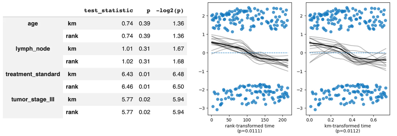
Notably, we can also see that treatment_standard failed the non-proportional test with a p-value <0.059. This tells us that while the model estimated HR=1.33, that’s an average over the entire follow-up period. What the Schoenfeld test is telling us is that the true ratio between the standard and experimental arm hazards is drifting across time and the single HR of 1.33 is a weighted average of a moving target. In biological terms this could reflect a strong early treatment effect that erodes over time as patients develop resistance, which we can confirm by plotting the Schoenfeld residuals (note the downward drift from left to right, suggesting the hazard associated with being in the standard group relative to the treatment group wanes over time).
The traditional cox model is most useful when you have a single predictor variable of interest and a small handful of covariates. For example, we could test whether AKT expression is prognostic in breast cancer when accounting for tumor grade, MammaPrint status, and other factors. But, what happens when we have thousands of potential predictors, as is the case in modern clinical trials where we may have both high-throughout gene expression and protein abundance data? This is where LASSO Cox models come in10.
Whereas the traditional Cox proportional hazards model asks you to manually select a small number of variables—either forcing all covariates into the model to calculate their weights simultaneously, or stratifying the data into distinct subgroups—LASSO Cox feeds dozens, hundreds, or even thousands of biomarkers into the model at the same time then runs an elimination tournament applying an L1 penalty to the cox partial likelihood, shrinking irrelevant coefficients to exactly zero and leaving you with a sparse subset of surviving biomarkers. For example, in a traditional Cox model we may have a single protein biomarker, such as AKT, as a variable of interest then we control for covariates—giving us a hazard associated with AKT expression.
In LASSO Cox, we instead take many biomarkers—say, 1000 different proteins—as variables of interest, then give a hazard associated with a weighted linear combination of them. To the extent that covariates like age, sex, or BMI are still included we could decide to (a) tell the model to exclude them from the L1 penalty loop, resulting in our protein biomarkers being evaluated given the presence of our covariates (ie, regressing out their effects) or (b) include them in the penalty look and let them compete. In this case any surviving clinical variable (like age) becomes an explicit part of the risk score formula, depicted below (note: this formula mathematically combines all non-zero predictors into a single metric that can be used a a prognostic signature).
We can then stratify our population by risk scores (for example, using the top vs. bottom quartile) and plot a Kaplan-Meier survival curve to visualize how well our your multi-biomarker signature separates high-risk patients from low-risk patients.
When multi-protein biomarker signatures outperform any individual protein biomarker it tells us that survival is not separable along any single biomarker axis. Instead, survival lives in the joint structure of the protein state space. This means that the attractor landscape governing patient survival has geometry that can’t be captured by a one-dimensional projection (i.e., a threshold value of a single protein), which has under appreciated consequences and potentially explains why many protein biomarkers that are prognostic in one cohort fail to replicate in another. Typically, this is chalked up to biological heterogeneity or technical variation between studies. An alternative explanation, by contrast, is that a single protein is a noisy projection of a high-dimensional attractor boundary separating groups by survival outcomes.
Whether a single protein is prognostic, when viewed through this lens, depends on which other dimensions it happens to correlate with in the observed cohort. It’s less a question of whether the protein is or isn’t prognostic—it’s that prognosticity is is a property of the full state space, not any single axis. Multi-biomarker signatures, when they work, are approximating the true attractor boundary in the protein state space and the KM curve separation you observe is evidence that the signature has found a projection that resolves the basins (i..e, that the one-dimensional risk score captures enough of the high-dimensional geometry to distinguish which attractor a patient is being pulled towards).
This is also why even multi-biomarker signatures often fail to generalize across cohorts after being validated internally—if the attractor geometry shifts between patient populations due to differences in treatment history, age, or other factors, the projection that resolved the basins in one cohort may no longer align with the boundaries in another cohort. So, despite log-rank tests, cox hazards proportional models and LASSO cox models getting progressively better at approximating the attractor landscape within a cohort, there remains an unsolved problem in that the landscape itself shifts between cohorts, and no current method handles that reliably. This is the core argument for using foundational models applied to survival. If you can embed patients into a representation space learned from millions of cells or patients, the embedding may capture attractor geometry that generalizes across cohorts because it was learned from sufficient diversity to approximate the true landscape.
TLDR / Takeaways
Kaplan-Meier curves and log-rank tests work well for visualizing and quantifying differences in survival between groups when a single classifier (control vs. treatment, responder vs. non-responder, etc.) or biomarker (top vs. bottom quartile of protein abundance, for example) has a strong impact on survival. However, in practice seeing meaningful differences in a log-rank test requires that you’re already slicing up the population with fine-grained resolution. For example, AKT in not a prognostic biomarker in heterogenous breast cancer cohorts. But, it’s a prognostic among triple-negative breast cancer (TNBC) non-responders meaning that patients with high AKT have worse survival than those with low AKT (note: this finding requires pre-stratifying to a specific subgroup first). From a complex systems perspective, that pre-stratification is doing a lot of heavy lifting: by restricting an analysis to TNBC non-responders, you’ve moved into a region of state space where the attractor boundary separating survival outcomes happens to align with the AKT axis. In the full heterogeneous cohort, that alignment is washed out by patients whose survival is governed by entirely different dimensions.
In practice when working with more heterogenous cohorts Cox models often better identify risk associated with a given factor, like AKT expression, as they regress out other confounding variables (these analysis are still anchored to a primary variable and group membership is either that primary variable or a covariate). However, in many cases even Cox models are insufficient as low-dimensional predictors often fail to capture the biology driving survival differences. As a result, LASSO Cox models can be used to create higher dimensional risk predictors that better map the attractor boundaries between survival groups (i.e., what tips a patient from one attractor basin into another).
Even high-dimensional LASSO Cox models have their limits though in that they are typically specific to the patient population they were built, explaining why they often fail to generalize when underlying patient populations differ sufficiently from the discovery cohort (this is even true when superficial characteristics are stable, such as going from one TNBC population to another as many confounders are not encapsulated by the TNBC label, measured proteins in the signature, and other included covariates. This is why creating a viable predictive signatures in disease like cancer is so difficult. It’s also the basis for the move towards survival foundation models, though it’s not clear this really solves the underling problem—instead, it just changes the form of the generalization problem in a manner that is more easily solved via scaling.
Nonparametric refers to the fact that the graph makes no assumptions about the underlying distribution of data.
Censored patients drop out of the patient set at their censoring time, but don’t count as event. As a result, the KM curve only steps down at event times, not at censoring times. This gives KM curves their characteristic staircase shape. Additionally, there are three types of censoring to account for including right, left, and interval censoring. Right censoring, where a patient leaves the risk set before an event, is the most common in oncology (and is the form modeled in this tutorial).
There are almost certainly more efficient ways to do this by scratch (just ask AI), let alone using standard packages. However, part of why I write these articles are to codify my own thinking and therefore my intent is to write code that works without worrying about optimizing it.
You can use the following code block to generate the synthetic dataset I used for this tutorial.
import numpy as np
import pandas as pd
np.random.seed(13)
n = 300
age = np.random.normal(55, 10, n).clip(30, 80)
tumor_stage = np.random.choice(['II', 'III'], n, p=[0.45, 0.55])
lymph_node = np.random.binomial(1, 0.6, n)
treatment = np.random.choice(['standard', 'experimental'], n, p=[0.5, 0.5])
lp = (0.02 * (age - 55) +  0.6 * (tumor_stage == 'III').astype(float) + 0.5
     * lymph_node + -0.4 * (treatment == 'experimental').astype(float))
protein_names, protein_data= [f'prot_{i+1}' for i in range(50)], np.random.randn(n, 50)
true_betas = np.array([0.4, 0.35, -0.3, 0.45, -0.35, 0.3, -0.4, 0.35] + [0.0]*42)
lp += protein_data @ true_betas
scale, shape = np.exp(-lp) * 800, 1.5
os_time =  np.random.weibull(shape, n) * scale
os_time, os_event = np.clip(os_time, 1, 3000).astype(int),  (os_time < 730).astype(int)
os_time = np.minimum(os_time, 730)
df = pd.DataFrame({'os_time': os_time, 'os_event': os_event, 'age': age,
    'tumor_stage': tumor_stage, 'lymph_node': lymph_node,'treatment': treatment})
for i, name in enumerate(protein_names):
df[name] = protein_data[:, i]Given a control and treatment group, we need to declare one Group 1 and the other Group 2. It doesn’t actually matter which you call Group 1 vs. 2. As long as you’re consistent you’ll get the same p-value either way.
Technically, a cox model with no covariates would give an identical p-value to a log-rank test. However, in practice if there were no covariates you wouldn’t use a cox model—there would be no point. Instead, you’d just run a log-rank test without using a cox model as a secondary test.
In these cases we can extend the cox model with time varying coefficients, or can even just split the survival period into discrete intervals and model them separately (though this does make the results more difficult to meaningfully interpret). To test whether the proportional hazards assumption is violated we can use Schoenfeld residuals. After fitting a Cox model, you plot the scaled Schoenfeld residuals for each covariate against time. If the assumption holds, those residuals should be flat (no trend over time). A slope indicates the coefficient is drifting, which means the HR isn’t constant.
When we encoded our categorical variables with get_dummies with drop_first=True, the experimental treatment condition became equivalent to False, while the standard treatment condition became equal to True. Therefore, the standard treatment arm is the reference state, and a HR>1 means being in that group increases the risk of death.
In a Schoenfeld test, the null hypothesis (H₀) is that the hazard ratio is constant over time. Therefore, p<0.05 means there is a statistically significant relationship between the residuals and time, proving the effect of that variable changes over time.
Notably, LASSO cox still has proportional hazards assumptions. There are cases where these assumptions do not hold, or where you may care more about predictive accuracy versus interpretability. In these cases Random Survival Forrest (RSF) models—which abandons proportional hazards assumption entirely—could be a better fit. RSF is a tree ensemble that handles nonlinearity and interactions automatically. Here, each tree is built on a bootstrap sample, splits are chosen to maximize survival difference between branches, and predictions are aggregated across trees. The output is a predicted survival function per sample instead of a hazard ratio. The tradeoff here is that you lose the clean HR interpretation and the ability to say “this covariate increases risk by X% holding others fixed” in favor of a model that better handles nonlinearity and complex interactions—which I’ve written about in depth here.