

Issue № 80 // Stable Points, Sensors, & Strange Attractors
From feature-level attractor geometry to dynamical systems state-space.


This article is a natural extension from a recent post titled Reflections on Cold Spring Harbor Laboratory’s AI in Biology Symposium. A bet I made in this piece is that the future of biotech won’t be all scaling laws, foundation models, and prediction. It may take a decade to see the limits of The Bitter Lesson (i.e., the idea that general-purpose methods leveraging computation and scale always beat out hand-crafted human knowledge) play out in biology, but I do believe that the value of understanding will come back in vogue—much in the same way that mechanistic understandings of the brain are being used to inform developments in AI (again).
This doesn’t mean I do not still see the value of AI in biology. I may be more bearish on AI than most 30 something year old biotech founders, but I’m also not squarely in the camp that traditional bioinformatics approaches, which assume that biological systems are inherently decomposable, are the way forward either. What’s often neglected is the third option—that we can recover the joint structure of biological systems without having to reduce them to independent parts or hand their complexity to a black box. This is where complex system science (CSS) comes in.
Both modern AI frameworks and CSS see biological systems as inherently non-decomposable, but they differ in what they do next. AI models treat cells as statistical objects—points in a high-dimensional feature space—and their goal is to learn a function that maps inputs to outputs. CSS by contrast treats cells as dynamic systems where their state is a point in a phase space governed by an underlying regulatory network. Here, the model is judged by whether it captures this geometry correctly.
Simply put, AI models aim to predict; dynamical models aim to explain. In this way, CSS acts as a bridge between modern AI and traditional translational bioinformatics. On one hand, it gives translational bioinformaticians a framework for generating mechanistic hypotheses—converting geometric observations about a state space into specific, testable predictions about which proteins govern state transitions, how accessible how accessible resistance states are, and why the same perturbation produces different outcomes in different patients. On the other hand, it gives AI researchers a geometric ground truth to evaluate whether foundation model embeddings have learned biologically coherent representations—whether clusters correspond to known attractor states, whether distances between clusters reflect real biological barriers, and whether perturbations in embedding space respect the underlying landscape geometry.
This article works through what that reframing looks like in practice starting with feature-level attractor geometry, where the distribution of individual proteins across a patient population reveals whether each protein behaves as a bistable switch, a stable core, or a graded sensor, and building toward system-level state space analysis using PCA and UMAP, where the global landscape of attractor basins becomes visible.
Issue № 80 // Stable Points, Sensors, & Strange Attractors
Measuring thousands of proteins in a tissue sample creates a high-dimensional biological state space in which each protein corresponds to a single dimension. Attractor geometry describes the discrete stable patterns, or states, that a complex system naturally settles into over time, mapping how those thousands of proteins interact within a cell.
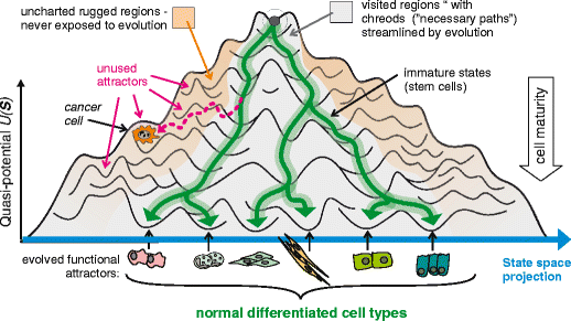
With so many variables, cells don’t randomly wander through the entire 20,000-dimensional space. Instead, they are drawn to specific, stable patterns of gene and protein expression. During development and differentiation, these variables define a massive multidimensional landscape in which each distinct cell state represents an attractor valley the cell has settled into. While a healthy cell occupies its own stable attractor, genetic mutations and environmental stressors can warp the landscape’s topography—lowering epigenetic and energetic barriers and allowing cells to slide into abnormal, pathological attractor states (i.e., cancer).
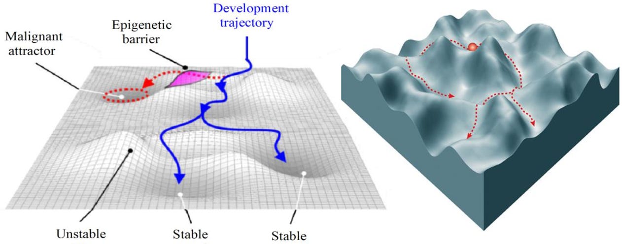
Attractor geometry gives us a way to survey the topography of the cell developmental landscape, quantifying the depth of valleys and the height of ridges. A disease like triple-negative breast cancer (TNBC) represents a deep, highly stable attractor basin surrounded by steep ridges. Because the basin’s “gravity” is exceptionally strong, minor therapeutic interventions fail to dislodge the system, making it exceptionally difficult to push cells out of this malignant state. Conversely, a treatment-naive cancer typically occupies a shallow, unstable basin with low ridges. Here, the underlying protein network is flexible, sensitive to external cues, and easily perturbed. While cells in shallow valleys are highly adaptable—and prone to spontaneous phenotypic drift—they are also vulnerable to targeted therapies, requiring relatively little energy to transition out of their current state. That said, under the selective pressure of a single targeted therapy, these cells can easily cross low landscape barriers, allowing the population to rapidly slide into an adjacent, resistant attractor basin.
These ideas are best depicted by Waddington’s Landscape, which conceptualizes attractor geometry as a hilly terrain. A healthy cell rolls down a path into a normal valley. In cancer, the topography is altered, causing the cell to roll into an unintended “cancer valley” instead. Once a cell’s protein profile enters the basin of attraction for a given cancer—say, HR+/HER2+ breast cancer—the regulatory networks lock it into that specific state, compelling continuous high-level expression of hormone receptors and HER2 proteins.
Understanding the geometry of these high-dimensional protein states reframes how we view cancer progression and treatment. Drug resistance, for example, can be reconceptualized as state shifting: treating an HR+/HER2+ tumor with a targeted therapy may flatten that specific valley, and instead of dying, the cell adapts its protein network and climbs over a molecular ridge into a different attractor—losing hormone receptors and becoming a resistant subtype. The same framework also provides a new lens for differentiation therapy, where instead of killing the cell, therapies reshape the attractor geometry, forcing the system out of the aggressive cancer attractor and into a benign, non-dividing state.

To make these concepts concrete, we can start with feature-level attractor geometry. It is possible to observe attractor-like patterns in individual proteins—plotting the distribution of HER2 expression across a cohort, for example, and seeing two distinct peaks for HER2− and HER2+ patients. But a single protein is a noisy, incomplete proxy for a cell state. HER2 expression alone doesn’t define the HER2+ attractor; it’s the coordinated activity of HER2, its downstream effectors, co-receptors, and transcriptional regulators together that constitutes the state. A protein can also be bimodal for trivial reasons unrelated to attractor structure such batch effects, antibody saturation, technical noise making individual protein distributions difficult to interpret with confidence.
A more rigorous approach is Principal Component Analysis (PCA). For this to work, biology must be the primary axis of variation in the population under study—otherwise batch effects will distort the geometry of the state space, as discussed in Modeling Latent Variation in High-Dimensional Data. Because human brains cannot visualize a 20,000-dimensional protein space, PCA collapses the 20,000-dimensional protein space into a small number of axes that capture the dominant structure of the data. Critically, PC1 is a weighted sum of all proteins simultaneously, so a bimodal distribution along PC1 is far stronger evidence of two attractor basins than bimodality in any single protein, because it means the entire protein network is bifurcated—not just one marker.
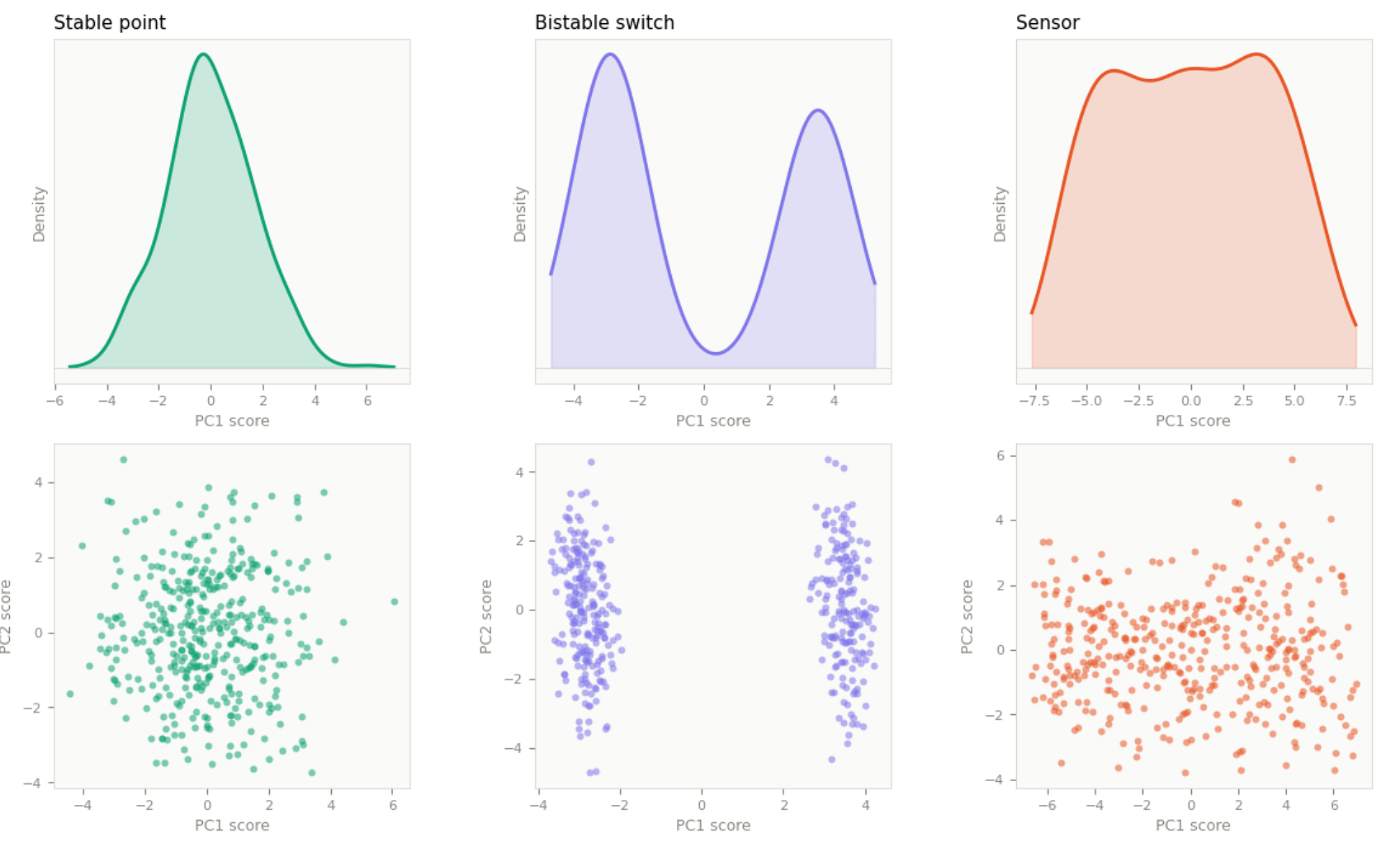
Analyzing the statistical distribution of sample scores along PC1 reveals the underlying global landscape. For a cohort of mixed breast cancer subtypes, three patterns are most informative:
A unimodal, bell-curve distribution (stable point) tells us the entire cohort occupies a single global energy minimum, with all samples pulled toward a central homeostatic setpoint. This is typical of a homogeneous population or a single tightly defined subtype.
A bimodal or multimodal distribution tells us the system is bifurcated or fragmented into multiple stable macro-states—the HER2− basin and the HER2+ basin splitting into two peaks, for example, with an unstable intermediate zone between them that patients rarely occupy. In a real mixed breast cancer cohort, this more likely manifests as a multimodal distribution across PC1, PC2, and PC3 together, with each peak representing its own stable, self-sustaining attractor basin governed by its own network of transcription factors.
A flat, linear distribution (sensor) tells us the cohort has no discrete stable states. Instead, samples are distributed continuously along the dominant axis of variation, tracking a graded input like overall tumor burden or immune infiltration with no preferred setpoint and no basin gravity.
The same analysis can be run within a single subtype, though the interpretation shifts. In a TNBC-only cohort, attractor geometry no longer reflects macro-disease states—it reflects micro-environmental responses and intratumoral dynamics. A bimodal PC1 here typically represents a treatment resistance toggle rather than a subtype boundary: half the patients may carry a secondary mutation that switches a downstream pathway, such as PI3K, into a hyperactive state to bypass therapy. A unimodal bell curve along PC1 reflects core subtype identity—the proteins defining TNBC locked into a shared stable setpoint. And a flat, linear PC1 reflects microenvironment sensors: patient-specific variables like tumor size, age, or hypoxia tolerance varying continuously with no preferred setpoint.
These three geometries—stable point, switch, and sensor—are resolvable from static cross-sectional data, such as single time-point gene expression or protein abundance measurements. Other attractor geometries exist and are biologically meaningful—limit cycles, strange attractors, and saddle nodes among them—but these require either time-series data (to observe the system moving through states sequentially) or single-cell resolution (to catch individual cells at different phases of a cycle simultaneously). A static bulk cohort snapshot cannot distinguish a limit cycle from a switch in PC space: both produce bimodal distributions. Resolving them is as much a data infrastructure problem as an analytical one, and it is one of the reasons the full operationalization of attractor geometry in clinical proteomics remains a work in progress.
Looking at PC1 alone often masks variation of interest. A 1D histogram of PC1 is a view from a single angle. Plotting PC1 against PC2 gives a richer perspective: do we see tight, distinct clusters with empty space between them—suggesting individual attractors with unstable intermediate states? Overlap between clusters, suggesting potential phase transitions? Or a single population splitting into distinct arms, mapping how one state destabilizes into two?
Something to keep in mind though is that while PC1 is an excellent indicator of two attractors, PCA is a linear transformation. If a biological system transitions between states along a curved or spiral path, PCA can warp the view or fail to separate attractors cleanly. When deep non-linear dynamics are suspected, computational biologists typically verify the PC1 distribution using non-linear dimensionality reduction tools such as Diffusion Maps, Kernel PCA, or UMAP.
While diffusion maps are ideal for trying to reconstruct a continuous biological process (like disease progression or cell differentiation, UMAP is the practical choice for single time point data, most common in to clinical studies. Rather than analyzing a 1D distribution, UMAP lets you study the topological distance and density of clusters in a 2D or 3D manifold—and because it is non-linear, it is far better at mapping complex, curved biological landscapes.
When you run UMAP on a protein expression matrix, the resulting layout maps naturally onto attractor geometry:
Dense, discrete clusters correspond to attractor basins. Denser clusters are consistent with deeper basins, though they are not perfect indicators.
Empty space between clusters represents high-energy, unstable transition states. Samples cannot stably exist there, so no local data points connect the islands.
Continuous ribbons or strings correspond to sensors or graded biological processes, where patients are evenly distributed with no preferred setpoint.
While UMAP is incredible for visualization, it has a mathematical quirk you must control when studying attractors: it forces data into clusters by default. If the true biological landscape is a smooth, linear sensor, an aggressive UMAP configuration can fracture that gradation into artificial islands—creating the illusion of multiple attractors where none exist. Setting n_neighbors high (100–200) forces the algorithm to prioritize broad global topology over micro-clusters; setting min_dist high (0.50–0.75) keeps points loosely and evenly distributed, preserving continuous gradients.
Ideally, though we can compare both PCA and UMAP side by side. To identify a bistable switch we should see a clear bimodal distribution in PC1, with two separate islands in the UMAP plot. To prove multiple stable states we look for distinct density could in PC1 vs. PC2 (or PC3), and multiple cleanly isolated islands on the UMAP plot. And, to identify a sensor we should see a flat linear distribution along PC1 and a single continuous ribbon on the UMAP plot. Notably, though, if PCA shows a standard, perfectly normal bell curve, but UMAP splits the data into two isolated islands, the UMAP islands are artificial. This mismatch tells you that UMAP’s non-linear forces over-optimized on random background noise, fracturing a single uniform homeostatic population into fake clusters.
The practical payoff of this framework depends on whether your focus is translational bioinformatics or AI x Bio.
For someone primary running differential expression and co-expression network analyses, mapping g attractor geometry doesn’t replace your existing analyses. Instead, it contextualizes the answers. When you identify differentially expressed proteins between two groups, attractor geometry asks a follow-up question: are those proteins defining the boundary between two basins, or are they downstream passengers of a state transition that happened upstream? A passenger protein will show up as differentially expressed but won’t sit at the ridge—perturbing it won’t change the system’s state. This is one mechanistic explanation for why so many differentially expressed proteins make poor drug targets. Attractor geometry provides a framework for filtering DEA output by functional relevance to the landscape.
Additionally, WGCNA and similar tools identify proteins that move together. In attractor theory, a co-expression module that is tightly correlated within one subtype but not another is a candidate attractor-defining module—the proteins that lock the system into a particular basin. The hub proteins of those modules become candidates for bifurcation-point targets. A practical workflow is as follows:
Identify proteins that are hubs in one subtype but not another.
Cross reference those with PC1 loadings. A protein that is simultaneously a subtype-specific hub and high-loading on the axis separating subtypes is your strongest candidate.
Test for bistability at the feature level: does that protein show a bimodal distribution across the full cohort? Bimodality in a hub protein is evidence that it is functioning as a switch, not a graded sensor.
One critical note on what bistability does and doesn’t tell you is as follows: identifying a bistable switch candidate tells you the protein governs a state transition. It does not tell you which direction of perturbation pushes the system toward the therapeutic goal. You could inhibit a switch protein expecting the tumor to transition from an aggressive to a benign state and instead push it into a third attractor—a more resistant, more aggressive state that was adjacent in the landscape but not the one you intended to reach. This is one potential; mechanistic explanation for why some targeted therapies accelerate resistance rather than preventing it: the drug perturbs a switch node, the system transitions—just not to the intended state.
For AI × Biology researchers, attractor geometry offers something more foundational: a validation framework for learned representations. When a foundation model like Geneformer or scGPT embeds a cell state into a high-dimensional vector, that embedding space is an implicit, learned approximation of the biological state space. The clusters in that embedding are the model’s learned attractors. Attractor geometry gives you a formal vocabulary for asking whether the model has learned the right landscape: do clusters correspond to known biological states? Are distances between clusters proportional to the actual biological barriers between them? Are there embedding regions corresponding to unstable intermediate states? Without this framework, evaluation of foundation model embeddings is mostly qualitative. With it, you can make quantitative claims about whether the model’s learned geometry is biologically coherent.
The same logic applies to perturbation prediction. Predicting what happens when you perturb a gene or administer a drug is fundamentally a question about how the system moves through state space under an intervention. A model that has learned the correct attractor geometry will predict that a perturbation near a ridge has qualitatively different effects from the same perturbation deep inside a basin. Most current models ignore this, predicting expression changes linearly without reasoning about state transitions. Attractor geometry is the theoretical framework that would make perturbation prediction physically grounded rather than purely statistical.
Finally, a major focus in AI x Bio is to produce a virtual cell, which can be used in applications like simulating a patient’s tumor to predict treatment response. This type of approach is only meaningful if the simulation captures the attractor structure of the real system. A virtual cell that fails to reproduce the correct basins and barriers will make wrong predictions about resistance, even if it accurately predicts individual protein expression levels. Attractor geometry provides the validation standard: does the simulated landscape match the empirical landscape estimated from patient data?
Thanks for reading! If you found this post useful, please consider subscribing or sharing it with a friend. I regularly shared hands-on computational biology techniques, fresh ways to think about tough problems, and perspectives on a range of related topics.