

Issue #78 // Bypassing Stability Assumptions in High-Throughput Proteomics
Eliminating samle-to-sample variations and batch effects, while preserving biological signal, in reverse phase protein array data.


Today’s article builds off an idea I wrote about in a recent piece, which is that the most consequential errors in an computational biologist’s analysis script aren’t the ones that trigger failures—they’re the ones that violate method’s underlying assumptions without raising red flags. Something as seemingly minor as applying the wrong normalization to data can derail an analysis before it even begins. This issue is common, stemming from the fact that there is no universal method; biological data is inherently messy and highly multivariate, and biological signals are easily masked by technical bias. As a result, it’s important to build a strong intuition around how different normalization methods work—both to appropriately handle various data types and to adapt common approaches to unique situations, even when working with familiar data.
Issue № 78 // Bypassing Stability Assumptions in High-Throughput Proteomics
Median centering is a common normalization approach in proteomics. The way this procedure works is that we take the median protein signal intensity for each sample, then subtract that value from each protein in the sample. Assuming a data frame is arranged with samples in the index and proteins as columns, the code to median center our data would look something like this:
df = df.subtract(df.median(axis=1), axis=0)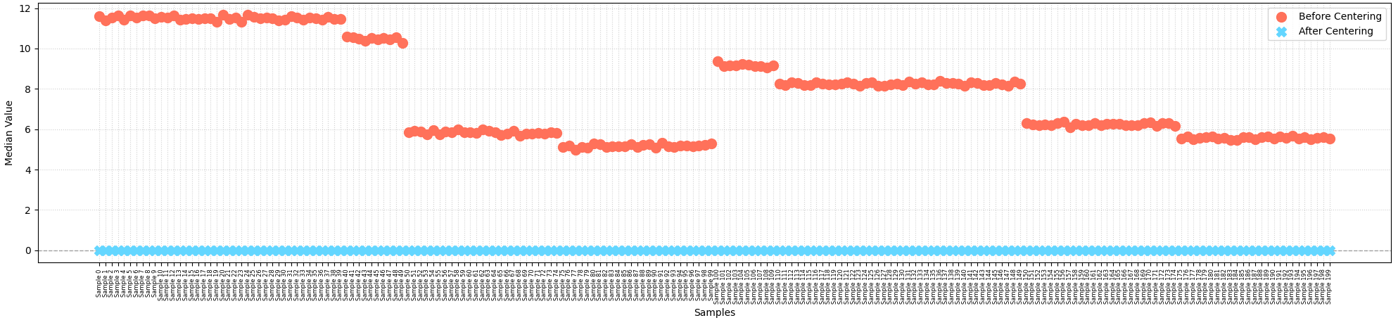
In principle, median centering should put all samples on a uniform scale so they can be compared apples-to-apples. Because this method uses the median rather than mean for centering, it dampens the impact of extreme outliers and adjusts the overall protein signal intensities of each sample to a common central point, correcting for systemic biases such as unequal sample loading1.
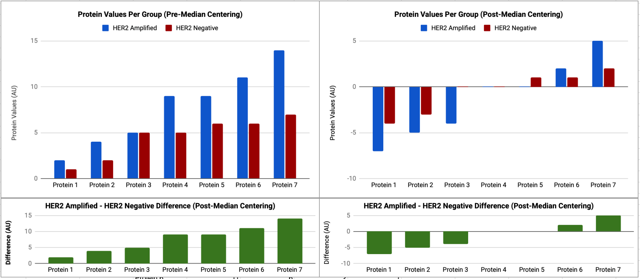
However, median centering has a major flaw in that it assumes (1) the majority of proteins do not vary between samples and (2) the number of proteins that do in fact increase or decrease between samples are roughly equal, neutralizing one another’s effects. If your study involves a condition that causes systematic global upregulation of proteins, these assumptions are violated, causing median centering to fail and ultimately skewing downstream analysis results. For example, I frequently work with reverse-phase protein array (RPPA) data from laser capture micro dissected tumors samples in high-risk breast cancer populations2. With RPPA, we measure a pre-selected panel of signaling proteins and phosphoproteins with known functions in cancer. As a result, if we were to compare two breast cancer cohorts—one with HER2 amplification and one without, for example—we should expect to see a large fraction of measured proteins upregualted in the HER2 amplified tumor samples. Now, consider what would happen if we applied median centering in this scenario.
For demonstrative purposes, let’s take a theoretical HER2 amplified and HER negative sample where we have proteins with values 2,4,5,9,9,11,14 (median = 9) and 1,2,5,5,6,6,7 (median =5), respectively. Let’s also posit that in this case there are minimal or no technical variations between samples, and therefore any differences in protein values are biological in nature. If we apply median centering to each sample the HER2 amplified patients median centered values are -7,-5,-4,0,0,2,5 and the HER2 negative patients median centered values are now -4,-3,0,0,1,1,2. When we compare these two samples, it now appears that all proteins values in the HER2 amplified tumors are systematically suppressed, making some proteins appear downregulated when they are not, and masking the degree to which others are upregulated, as demonstrated below.
The challenge here is that many mathematical normalization approaches are sensitive to these kinds of global changes in protein abundance and have a built in stability assumption3. To preserve true biological variations in these cases, we need alternative normalization methods such as total protein normalization (TPN), which utilizes physical dyes like SYPRO Ruby that non-specifically bind to the peptide backbones of all proteins present in a sample—yielding a fluorescent signal directly proportional to the actual physical mass of the cell lysate in each printed spot. Instead of relying on post-hoc mathematical assumptions, identical sets of apples are printed across multiple parallel slides where each slide is dedicated to probing just one specific target protein using a single primary antibody—a separate identical “sister” slide in the same print run is then stained with SYPRO Ruby, or another dye. Because the printing robot replicates the same grid layout on all slides, the data processing software overlays them to calculate a direct raw fluorescent antibody signal-to-physical mass ratio for every spot.
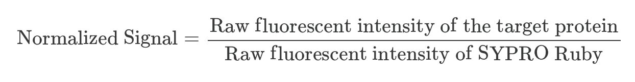
Dividing the raw fluorescent signal of the target protein on the antibody slide by the physical total protein mass measurement entirely bypasses the risk of mathematically over-scaling or over-correcting true biological hyper-amplification. As a result, if a tumor sample is globally amplified and overexpressing a large percent of signaling proteins, SYPRO Ruby accurately captures that true mass, preserving the authentic global biological signature.
From this description, you can see how this normalization approach addresses sample-to-sample variations caused by technical artifacts, such as pipetting inaccuracies or physical imperfections in the printing pins. By standardizing every spot against its own physical mass, the workflow corrects for instances where a specific sample droplet was printed with too much or too little volume, effectively placing all samples on an equal biological scale. However, this physical mass normalization alone does not account for variations in chemical antibody affinities or changing reagent lots across different experimental runs (called batch effects). As a result, this method cannot achieve absolute quantification or bridge separate experimental groups on its own.
To overcome these limits, we adjust the mass-normalized data using standard calibration curves, ensuring that results from different slides or processing days can be accurately compared. This correction method utilizes co-printed reference standards to model each antibody’s non-linear binding kinetics, converting relative signal ratios into standardized, continuous values and neutralizing any batch effects caused by a new bottle of antibody or an altered scanner setting. For example, imagine we have two antibodies, A and B. Antibody A binds highly to its target protein AKT, causing it to brightly flash under the scanner. Antibody B, by contrast, binds weakly to its target ERK, causing it to dimly flash, even if there’s an identical amount of AKT and ERK in the sample.
Calibrators, which contain control lysates expressing known dilutions of these target proteins, solve this problem by creating a separate baseline curve for each antibody, telling the data processing software exactly how much signal each intensity specific “glow” from the antibodies generates per unit if protein.
However, fluorescent signals do not rise forever in a straight line. If a sample has a massive amount of AKT for example, the antibody binding sites will saturate, and the amount of signal detected by the scanners photodiodes will plateau. Because the calibrators are printed in a known serial dilution series, they map out the non-linear “S-curve” of the assay and the software uses this curve to mathematically unwarp saturated signals or ultra-dim signals near the background noise floor. Calibrator also solves another problem. If you run the aformentioned AKT slide in January and another in June, the laser scanner’s sensitivity might have drifted, or the antibody bottle may have aged, creating batch effects that can skew experimental analyses. To address this, the exact same physical calibrator material is printed on both the January and June slides. By tying both runs back to a theoretically unchanging external standard, batch effects are largely neutralized4.
From a computational biologists standpoint, TPN addresses sample-to-sample variations and calibrators address batch effects before we even receive a CSV file with the data. This means that known technical sources of offset and batch artifacts are largely taken care of for us. However, saying “we corrected for what we knew about” is not the same as “all remaining variation is biological.” Residual technical variations can still survive the aforementioned corrections for reasons we already discussed in footnote 4—upstream sample preparation differences, protein degradation, freeze-thaw cycles. So, the question becomes, how would you know whether a systematic sample-level offset is technical or biological in origin? You can’t just assume it’s biological because you ran the normalization pipeline, though most people do (this type of thinking runs parallel to what I discussed in What Actually Makes Someone Good at ML in Computational Biology?).
To assess whether this is the case we can check whether batch membership predicts sample-level offset within each cohort. At the simplest level, we can ask if the median protein values for experimental samples in batch 1 are systematically higher or lower than experimental samples in batch 2, and if the same pattern holds for control samples between batches. If so, we’ve identified a batch effect signature. However, we need to be careful with this approach as it compresses a lot of information, which means risking a false negative (i.e., not finding batch effects that do in fact exist).
An alternative approach is to perform principle component analysis—fitting the model on the combined data—then plot the first two principle components with data points colored by both batch and and cohort/group (i.e.m two separate versions of the same figure). If principle component 1 (PC1) and PC2 separate samples by batch more cleanly than by cohort (biology), batch effects are present. The logic here is straightforward: after the previous normalization steps we expect cohort-specific biology to be the dominant axis of variation—if it’s not, then batch is a confounding variable.
def PCA(metadata_df, protein_df):
  '''
  This code assumes we have two dfs. One with metadata (batch, cohort), ...
  ...another with proteomic data. Both dfs share a common index containing sample IDs.
  '''
  # z-scale data (assumes rows = samples, proteins = columns)
  protein_df_scaled = protein_df.subtract(protein_df.mean(axis=0),axis=1)
  protein_df_scaled = protein_df_scaled.div(protein_df.std(axis=0), axis=1)

  # PCA
  pca = PCA(n_components=2)
  pca_results = pca.fit_transform(protein_df_scaled)
  pca_results_batch = pd.DataFrame(pca_results).set_index(metadata_df['batch'])
  pca_results_biology = pd.DataFrame(pca_results).set_index(metadata_df['her2'])

  # Visualize PCA
  sns.scatterplot( x=pca_results_batch.iloc[:, 0], y=pca_results_batch.iloc[:, 1], hue=pca_results_batch.index)
  plt.title('PCA Results Colored by Batch')
  plt.xlabel(f'PC1 (Explained Variance {round(pca.explained_variance_ratio_[0],2)})')
  plt.ylabel(f'PC2 (Explained Variance {round(pca.explained_variance_ratio_[1],2)})')
  plt.show()
  sns.scatterplot( x=pca_results_biology.iloc[:, 0], y=pca_results_biology.iloc[:, 1], hue=pca_results_biology.index)
  plt.title('PCA Results Colored by HER2 Status')
  plt.xlabel(f'PC1 (Explained Variance {round(pca.explained_variance_ratio_[0],2)})')
  plt.ylabel(f'PC2 (Explained Variance {round(pca.explained_variance_ratio_[1],2)})')
  plt.show()
  return None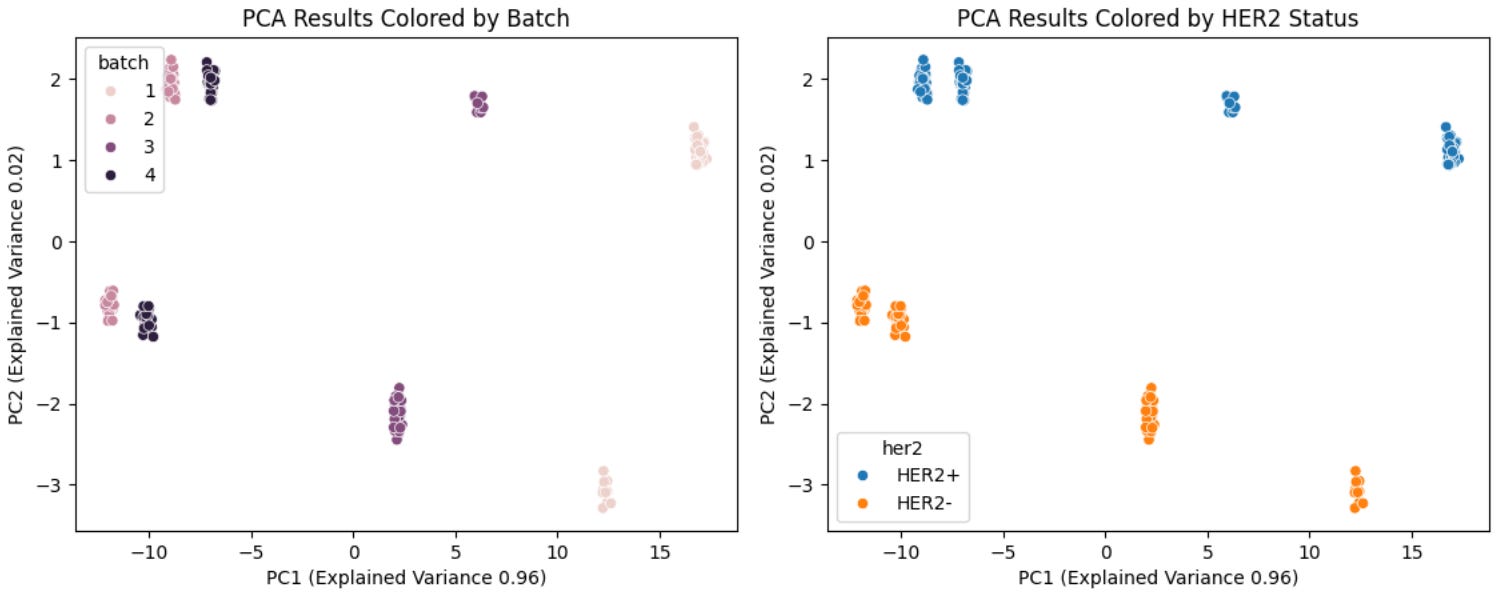
Another option is to use a variance components analysis. If we take a single protein in our dataset, we can see how its level varies across patient samples—some samples are higher, some lower. The question this analysis asks is what’s driving that variation. Is it batch membership, biology, joint effects, or unexplained variables? We can answer this question by decomposing the total variance in that protein’s abundance into components attributable to each factor. If batch explains 40% of variance and biological group/cohort explains 15%, you know batch effects are present. If biological group explains 40% and batch explains 5%, you’re in good shape. After running this test across all proteins we get a distribution of variance explained by batch versus biology, among other factors—which is far more informative than a single test. You can plot this distribution to identify which proteins are most batch-affected, and make a principled decision about whether correction is needed and how severe the problem is.
def variant_component(df, prot_col_start=2):
  # Lists to store variance contributions
  batch_variance_contributions = []
  her2_variance_contributions = []
  joint_variance_contributions = []
  unexplained_variance_contributions = []

  for i in df.columns[prot_col_start:]:
    # Fit 3 models per protein: full model (her2+batch), her2 only, batch only
    full_model = smf.ols(f'{i} ~ C(her2) + C(batch)', data=df).fit()
    her2_only = smf.ols(f'{i} ~ C(her2)', data=df).fit()
    batch_only = smf.ols(f'{i} ~ C(batch)', data=df).fit()

    # Extract R-squared values
    R2_full = full_model.rsquared
    R2_her2_only = her2_only.rsquared
    R2_batch_only = batch_only.rsquared

    # Calculate unique variance contributions
    batch_contribution = R2_full - R2_her2_only
    her2_contribution = R2_full - R2_batch_only
    joint_contribuion = R2_full - batch_contribution - her2_contribution
    unexplained_contribution = 1.0 - R2_full

    batch_variance_contributions.append(batch_contribution)
    her2_variance_contributions.append(her2_contribution)
    joint_variance_contributions.append(joint_contribuion)
    unexplained_variance_contributions.append(unexplained_contribution)

  # Plot distributions
  plt.figure(figsize=(10, 5))
  sns.kdeplot(her2_variance_contributions, fill=True, color="blue", label="HER2 Status", alpha=0.5)
  sns.kdeplot(batch_variance_contributions, fill=True, color="orange", label="Batch Effects", alpha=0.5)
  sns.kdeplot(joint_variance_contributions, fill=True, color="green", label="Joint (Shared)", alpha=0.5)
  sns.kdeplot(unexplained_variance_contributions, fill=True, color="red", label="Unexplained", alpha=0.5)
  plt.title("Variance Explained Distributions Across 120 Proteins", fontsize=14)
  plt.xlabel("Proportion of Variance Explained (Semi-Partial $R^2$)", fontsize=12)
  plt.ylabel("Density", fontsize=12)
  plt.xlim(0, 1)
  plt.legend()
  plt.show()
  return None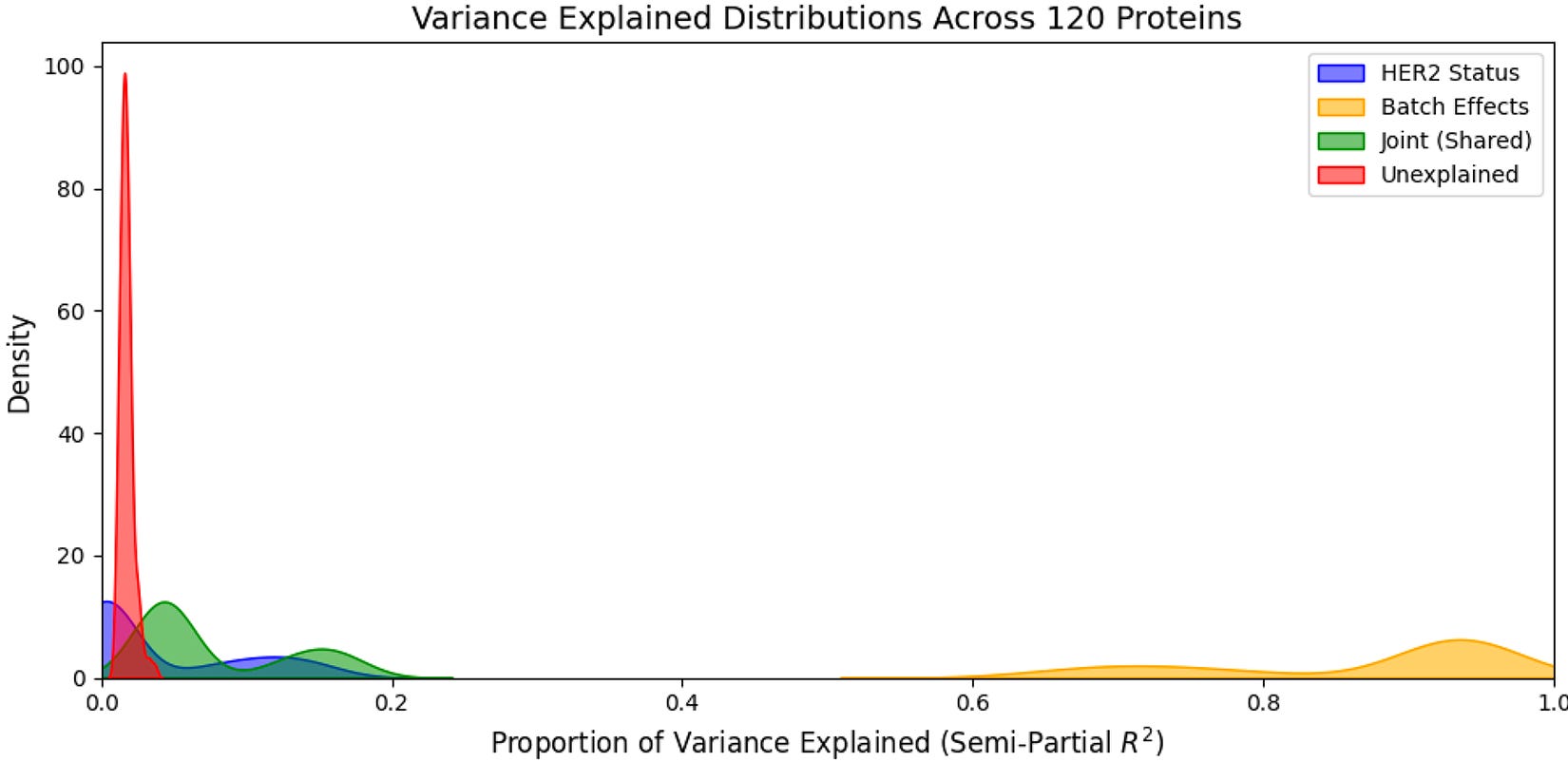
In this case above, we can see that a low proportion of the variance explained is attributable to HER2 status, joint effects (HER2 status + batch), and unexplained variables while a high low proportion of the variance explained is attributable to batch. This means that even after performing standard normalization procedures for RPPA data, batch is still a major axis of variation in our dataset, confirming the results from our PCA analysis above (note: in this case this is actually expected as the proportion of HER2+ and HER2- samples are unequal between batches, meaning batch and biology are correlated… this is not ideal from an experimental design standpoint).
In cases like the one above where batch effects are present we can perform a version of sequential median centering where we (1) identify the median for each batch, then subtract that from all within-batch samples, (2) then perform standard median centering on all samples, subtracting the sample-specific median value from all proteins within a given sample, and finally (3) compute the global median across all samples, then add that to each one5.
# Get the string names for all protein columns
prot_cols = df.columns[2:].tolist()

# Subtract batch median
df[prot_cols] = df.groupby('batch')[prot_cols].transform(lambda x: x - x.median())

# Subtract sample median
df[prot_cols] = df[prot_cols].subtract(df[prot_cols].median(axis=1), axis=0)

# Compute global median (GM); then add GM to all samples
global_median = np.median(df[prot_cols].values)
df[prot_cols] = df[prot_cols] + global_median

# View updated variance explained distribution
variant_component(df, prot_col_start=2)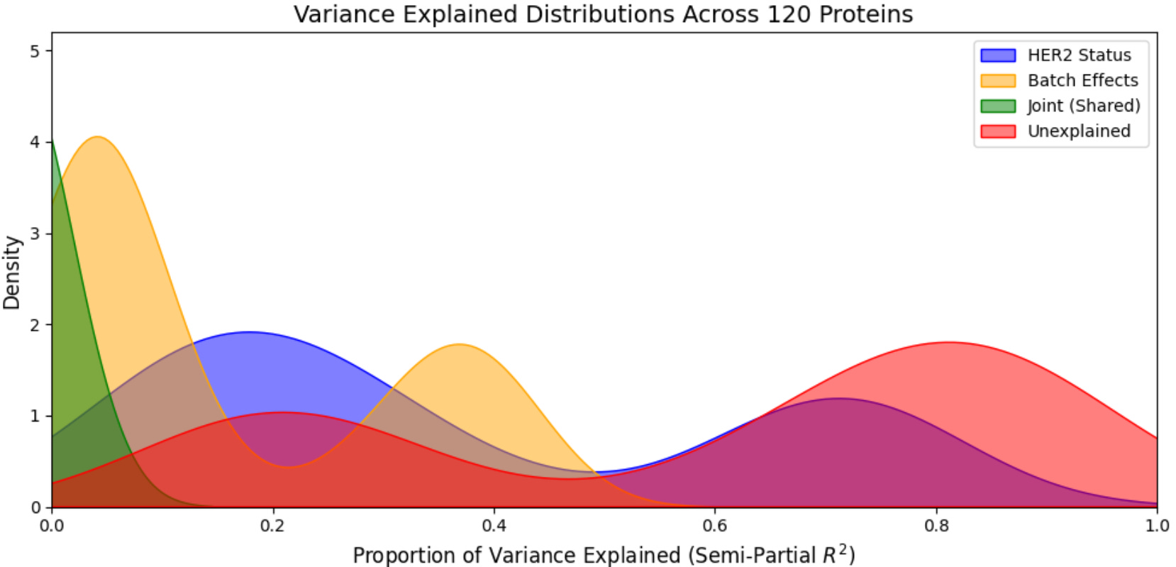
As you can see in the image above, HER2 status (biology) and unexplained variables are now largest sources of variance in the dataset, with batch effects still present but weaker. One confident that batch effects have been removed to as much an extent possible—or if they were eliminated by the initial standard normalization approach—we can move straight into the next step where we focus on managing true biological variations in our data.
Protein concentrations often change exponentially in cancer, creating a lot of variance in our data (specifically, RPPA proteomic data often has a right-skewed distribution where the majority of values cluster on the lower end, but a long tail extends toward much high values. In this scenario, the mean is higher than the median because extreme outliers pull the average upwards). To stabilize this variance we can use a log2 transformation, which converts multiplicative changes in additive changes (log2 transformation stretches out small changes and compresses larger ones, essentially “linearizing” the data6). There, a two-fold increase in protein expression (log2FC = 1) and a two-fold decrease (log2FC = -1) are placed on symmetric sales, creating a normal distribution that is ideal for parametric statistical tests7.
Additionally, because different proteins exist on vastly different scales—some being highly abundant structural elements and others being trace signaling molecules—there are instances when we may want to perform z-score transformation on RPPA data8.
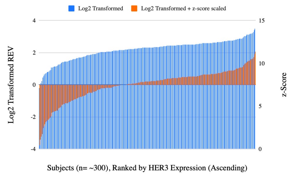
Importantly, z-scoring is calculated across the entire combined dataset other than within each cohort independently (the latter would inadvertently erase the true biological differences between our groups). By scaling each protein across the pooled population to a global mean of 0 and a standard deviation of 1, all proteins are brought into the same relative range, allowing you to generate legible, accurate heatmaps and figures that faithfully preserve the true biological shifts between your cohorts, for example, or use the data for downstream ML applications that assume normally distributed, zero-centered features with uniform variance.
Thanks for reading! If you found this post useful, please consider subscribing or sharing it with a friend. I regularly shared hands-on computational biology techniques, fresh ways to think about tough problems, and perspectives on a range of related topics.
Here, unequal sample loading refers to cases where the robotic printing needle drops a slightly larger or smaller microscopic droplet of a patient’s cell lysate—the liquid mixture containing all the proteins extracted from their tumor or cells—onto that specific spot
Laser capture microdissection is a sample preparation technique that occurs upstream of the printing process to ensure the aforementioned microscopic droplets of lysate are derived strictly from target cells and contain no background tissue contamination
The stability assumption is that the majority of measured protein’s abundance is not affected by the experimental condition, and therefore protein expression is largely stable between samples.
I write “theoretically” because this assumes the calibrator material itself is stable. Additionally, it’s worth noting that while calibrators correct for systematic drift in antibody signal and scanner sensitivity then cannot correct for batch effects stemming from sample preparation upstream of printing—freeze-thaw cycles, lysis buffer variation, protein degradation, etc.
Alternative methods like ComBat exist, which address both an additive shift and a multiplicative scaling factor, accounting for batches that don't just shift values up or down, but compress or expand the variance. However, this approach assumes that each batch has an equal proportion of control and treatment samples. If this is imbalanced, variance will be different between batches (for example, if one batch has 25% HER2 amplified sample sand the other has 75%) and ComBat will remove this source of variation incorrectly. To determine if this is the case we can create a contingency table and calculate Cramer’s V to determine the degree of association between batch and cohort.
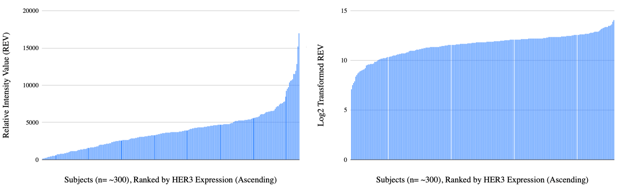
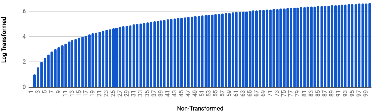
It can be hard to visualize what it means to stretch small changes and compress larger ones. To better understand, check out the following visualization which plots 1-100 non-transformed on the x-axis and log2 transformed on the y-axis. Visually you can see how the difference in log2 transformed values between 0 and 1, 1 and 2, etc on the x-axis is much larger than the difference in log2 transformed values between 99 and 100, for example.
The Wilcoxon rank-sum (WRS) test is commonly used for differential expression analysis with RPPA data. In this case, log2 transformation is not necessary prior to DEA, as the WRS test converts your raw data into ordinal ranks (1st, 2nd, 3rd, etc.) before performing the statistical calculation. However, log2 transformation is still useful for downstream visualization, and when calculating fold-changes.
z-score transformation should not be applied before differential expression analysis as it will wash out between cohort differences, but should be used before clustering as many methods are highly sensitive to the scale of input features.
Naive question, usually in gene expression data they say that use CombatSeq to only confirm presence of batch effects but not to use the corrected raw counts for DEG analysis, instead use batch as a covariate in linear models. So for protein expression, as you have mentioned, when doing a WRS it is okay to do normalize and log transform, but what if we were to use linear models to identify differentially expressed proteins between two groups?
Your complicated assessments of things make me think that you could understand that I'm having difficulty overcoming the intracted incorrect ideas of science? Even without a lot of background about the basics of science being done correctly try reading: unmasking quantum mechanics: when did magic become science?